
 Keen-eyed TeachersFirst users have probably noticed a few changes on the site during the past few months. Take a look at our Special Topics pages to find several new additions, including Resources for Storage, Classroom Management Resources, Tools to Create Media, and more. TeachersFirst Edge (tools for creating) includes new categories to make searching easier for you. Browse through Edge categories to find the latest free resources for Augmented Reality, Virtual Reality, Digital Annotation, and other tools to bring the newest technology into your classroom.
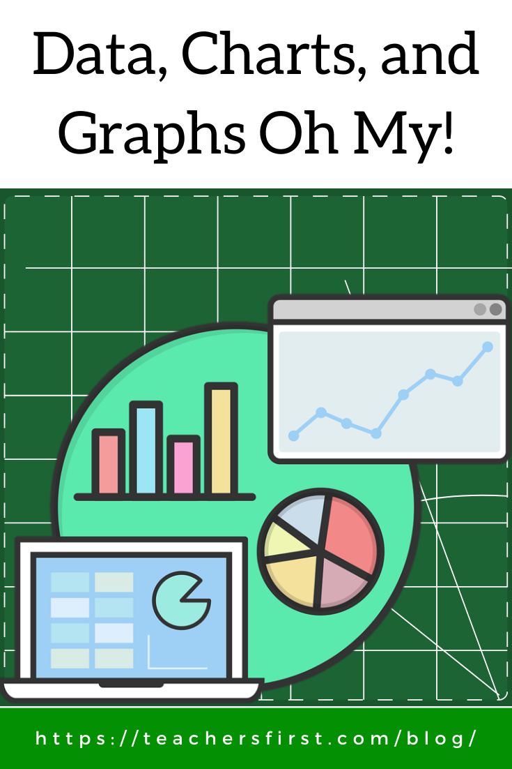
One of my favorite new additions is the Edge category for Data Visualization. Items found in this category include a variety of online resources to use when creating and sharing different forms of data. The web tools found on the data and visualization page include a variety of sites for creating and sharing data. Using these tools helps us understand complex information through visual representations and aids in the learning process.
But how do you choose the resource that is best for your needs? Here is how to use the content within each review to match you with the perfect tool for data visualization based on the information you want to create and share.
- Start by selecting a tool appropriate for your grade level. Look underneath the name of each resource to find the recommended grade levels for use.
- Read the first sentence or two before opening the full review. The first sentence provides a short overview of the site. If it looks promising, click the “more” link to open up the full review. Understanding the capabilities of any website is especially helpful if you want to create a specific type of display, such as a pie chart or line graph.
- Look in the box labeled “Edge Features.” The ruler in the box indicates the difficulty level of the resource. Easier to use tools have a blue or green ruler, resources requiring a bit more tech know-how are yellow.
- Continue browsing through the “Edge Features” box. The features section includes additional information to know before using the website. Information in this section offers tips such as whether registration is required in order to fully use this resource and if the tool offers sharing by URL or embedding into other sites. Other information lets you know that there is a premium version that offers additional features that aren’t free. Don’t worry if you see that there is a premium version, the TeachersFirst review only discusses the free features found on the site at the time of the review, so you know right away what is available without payment.
- Gather ideas on how to use the data visualization tool within the “In the Classroom” section. This section is where we share ideas on integrating this technology into your classroom to enhance and extend learning. Many ideas suggest uses for displaying information across the curriculum, not just in math class.
- If you didn’t find what you were looking for, use the reviews to browse to additional resources to help you find what you need. Use the tags found in reviews to continue your search. Look through the resources on the Data and Visualization Special Topics page, they include tags to find tools for charts and graphs (204), infographics (51), and data (156). Of course, make sure you use the tips above to manage your time when browsing through all of these reviews!
Think about all of the ways to bring information to life and increase understanding with charts and graphs. Late last year, I visited China, and one of my biggest impressions was the sheer size of all of the cities. I know that China has a population of over a billion people; however, I never took the time to visualize how that would look. After returning home, I thought about it some more and tried to compare the size of Chinese cities to American cities and created a quick bar chart using Online Charts (TeachersFirst review). The difference in sizes of cities is obvious on the chart; perhaps if I had seen this before leaving, it wouldn’t have been as surprising during my visit. Think of the various circumstances that arise in your class where using data visualization is helpful to increase understanding and clarify content.
Use a similar technique to help students visualize any type of data set. Record and compare the number of insect species to mammals and birds, compare populations of U.S. cities, or record the number of books your class reads each week. Ask older students to research the number of casualties from different countries during World Wars then convert to the percentage of their country’s total population as a way to analyze the overall effect on their country. Charts and graphs offer opportunities to engage and extend learning in every subject.
Learn more about effective ways to share and communicate data by attending the upcoming OK2Ask Data and Charts and Graphs, Oh My! Let Google Tools Be Your Guide session on February 4. This free session provides practical ways for you and students of all ages to use technology to enrich the curricula by visualizing data. Session details and registration information are available here.
There are many excellent data visualization tools available for classroom use. Take advantage of them to bring meaning to data in a variety of ways. Quickly switch between different types of graphs to demonstrate ways to visualize and represent information. Change data within charts easily through the use of these tools. Allow students to experiment with changes in information and data as part of the analytical process.
Have you found a data visualization tool that works for you and your students? Do you know about an excellent, free pictograph creation tool? If so, please share. We would love to hear your thoughts, consider sharing in the comments below.